Designing the BESCII Font
To refresh a classic pixel font and give it a new personality, I had to take several things into account.
When Ulrich Hecht, the developer of BASIC Engine decided to change from the custom-built Single Board Computer he designed to one of the more powerful, commercially availables ones, he realized it was a good opportunity to incorporate UTF-8 into Engine BASIC, the BASIC flavor he developed for the modern retro computer he created, as it would allow people from different parts of the world to use the system.
Up to that point, he'd been using pixel fonts he got from the internet. For the system, he used HP 100LX 6x8, a font taken from the HP 100LX and 200LX palmtop computers, available at The Ultimate Oldschool PC Font Pack. That font was rather complete, thought it was later replaced by Lexis, an improved version.
But for "games", he was using C64 Pro Mono from Style 64. That font is a faithful recreation of the C64 font known as PETSCII. The problem with that font is that, as the original it was based on, it only has ASCII characters, so it can't be used in any language other than English.
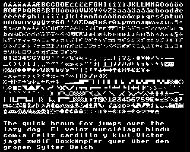
It was at that point that I decided to create a pixel font based on PETSCII, but that included all the necessary characters to be used with most European languages, as well as Japanese. So, BESCII was born.
Designing the font
To design this font, I took the following things into consideration:
- The font had to have double pixel verticals, and single horizontals, like most pixel fonts of the time. This was a design consideration made to improve the font readability on CRT screens.
- The characters that were inconsistent, or had weird designs would be redesigned to be more consistent and look more like part of a family.
- Legibility and accessibility would be taken into consideration, so characters couldn't have the same shape as others to avoid confusions (in characters like "I", "l" and "1", for example). X-height should be enlarged where possible.
- This would be a sans-serif font, so serifs should be removed as much as possible (unless needed for readability).
- Improve ascenders, descenders and overal geometry of the glyphs.
- Include pixel art, in the same way PETSCII had card suits included for games1.
With all this in mind, I set out to design the font. A comparison of the original in which it was inspired and the final result can be seen below:

Overall, I think the shapes of the glyphs turned out really well. It has a bit of an "Helvetica" feel to it, and the "tail" of the "i" and "l" is really pleasing and particular. The whole font looks more cohesive (especially the lower case letters), and it looks like a complete family. While I haven't seen anybody using the pixel art for a game yet, I think its inclusion is a nice bonus.
The font was released on a CC0 1.0 Universal license, so it's basically public domain. Do whatever you want with it. You can get it at GitHub. Enjoy.
Footnotes
- "Creating PETSCII" by Leonard Tramiel – Vintage Computer Stories. — Ret.: . ↩